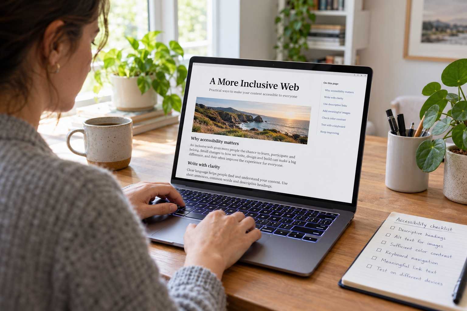
Accessibility problems can be introduced by a tiny CSS or form change, so an annual audit alone is too late. The useful decision is the one that improves a real task for a real user. Identify the constraint before choosing a tool, metric or redesign.
Why this deserves attention
MDN Web Docs offers a practical reference for web behaviour, performance and accessibility. A small team can use that foundation to test a claim in its own product rather than adopting a tool because it is fashionable. The practical question is whether the change improves reliability, access, privacy or maintenance. A repeatable short check protects basic navigation while leaving room for deeper testing with real users. The relevant measure is the effect on the product and its users, not the novelty of the implementation.
A practical way forward
Tab through the changed page, inspect focus visibility, read form labels aloud and test error messages with the keyboard. Set a baseline with one representative task, make a small change and repeat the same check. Share both the result and any trade-off the team observed.
Picture it in a real situation
After adding a modal, confirm that focus enters it, remains usable and returns to the triggering control when it closes. The value of the example lies in making the result observable. If it fails, examine one assumption at a time before replacing the whole workflow.
What to avoid
Avoid relying on a single automated score as proof that every person can complete the task. Test the claim against the version and workload you actually run. A screenshot or benchmark from another product is a clue, not evidence that your users will benefit.
Takeaway
Pick one measurable improvement, test it with a representative user path and document the trade-off.
Sources and further reading: W3C accessibility easy checks; W3C modal dialog pattern; MDN Web Docs.