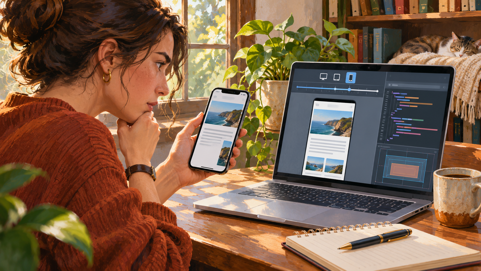
Editorial illustration; the devices and page are representative.
A page can look fine in a desktop browser and still be hard to use on a phone. The menu may disappear, a button may sit beyond the screen edge, or text may become so small that users have to zoom. The quickest way to fix it is to reproduce the problem at the width where it occurs, then find the element forcing the layout wider than the viewport.
This workflow is for site owners and developers who can inspect the page in a browser. It avoids the common trap of changing several CSS rules until the screenshot looks better at one size.
Summary
- Reproduce the issue at the affected viewport and record the browser, URL and interaction.
- Find horizontal overflow before changing breakpoints; one oversized child often causes the whole page to feel broken.
- Check both emulation and a real phone, especially for menus, forms, sticky elements and touch targets.
- Fix the layout rule responsible, then retest nearby widths and the page’s main task.
Start with the failure, not the breakpoint
Write down what “broken” means. Is the page wider than the phone? Does a control overlap another? Does the problem appear only after opening navigation, rotating the device, or entering a long value into a form? A useful bug note might say: “On Safari iPhone portrait, the pricing table pushes the page 120 pixels sideways; the issue starts after the table loads.”
That detail narrows the search. If you jump directly to a media query, you may hide the symptom on one screen while keeping it at another width.
A practical browser workflow
1. Reproduce the same page state
Open the exact URL and repeat the same steps that reveal the issue. Use the browser’s responsive design mode to set a narrow viewport. In Chrome, Device Mode can simulate dimensions, orientation and network conditions; in Firefox, Responsive Design Mode offers similar controls. Emulation is a fast way to inspect layout, but it does not reproduce every device font, browser quirk or touch interaction.
Keep notes about viewport width and zoom. A page viewed at 200% browser zoom has a narrower effective layout than the same window at default zoom.
2. Look for horizontal overflow
Scroll sideways, or run this in the developer console:
[...document.querySelectorAll('body *')]
  .filter(el => el.getBoundingClientRect().right > document.documentElement.clientWidth)
This is a clue, not a complete diagnosis: shadows, transforms and intentionally off-canvas menus can also extend past the edge. Inspect the returned elements and ask which one should be constrained. Common culprits include a fixed-width image, a long URL, a code block, a table, a flex child that refuses to shrink, or a width set in pixels.
Use the element inspector to toggle suspicious CSS rules one at a time. If disabling min-width, a fixed width, or white-space: nowrap removes the overflow, you have a likely cause. Avoid adding overflow-x: hidden to the whole page as a first fix; it can conceal content users need to reach.
3. Inspect the container and its children
Check the parent width, padding and box-sizing, then inspect the child’s intrinsic size. A common fix for a flex or grid child is min-width: 0, which allows it to shrink below its content’s minimum width. Images often need max-width: 100%; height: auto. Tables may need a horizontally scrollable wrapper rather than being squeezed into unreadable columns.
For long identifiers or URLs, decide whether breaking the string is acceptable. overflow-wrap: anywhere can help prose, but it may make code or product identifiers harder to read. Use a deliberate code-block scroll area for code instead.
4. Test the interaction, not only the screenshot
Open the mobile menu, submit a form, focus a field, dismiss a banner and follow a primary link. Check that sticky headers do not cover the focused input or anchor target. Try keyboard navigation as well as touch, and verify that controls remain usable when text is enlarged.
A screenshot can look correct while a menu button has no accessible name or a form control is impossible to reach. For accessibility guidance, compare the page with the W3C Web Content Accessibility Guidelines.
5. Confirm on a real device
Once the layout is stable in emulation, use a real phone if the issue involves Safari, Android browser behavior, keyboard appearance, touch, or device-specific fonts. You can use remote debugging tools where available, or simply keep a short manual test checklist. Testing every phone is unrealistic; cover the actual affected device and one common alternative browser if the page is important.
Example: a pricing table creates a sideways page
Imagine a three-column comparison table. On desktop it fits, but on a phone the final column is off-screen. Setting every column to a tiny percentage technically removes overflow, but makes the prices unreadable. A better choice may be to put only that table inside an overflow-x: auto wrapper and add a visible cue that it can scroll. If users must compare plans, also consider a stacked mobile presentation with clear plan labels.
The right fix depends on the content task. Preventing overflow is useful; preserving meaning is the goal.
Mistakes that waste time
- Adding a breakpoint before identifying the wide element. The problem may be an intrinsic image or a child that cannot shrink.
- Testing only one width. A fix for 390 pixels can fail at 430 or 768 pixels.
- Hiding overflow globally. This can clip menus, focus outlines or content.
- Trusting emulation for every browser issue. Real-device behavior still matters for keyboards, fonts and touch.
- Changing many CSS properties at once. Make one change, then repeat the original test so the cause stays clear.
Why this matters
Mobile layout failures often block a task rather than merely making a page unattractive. If a customer cannot reach a payment button or a reader cannot use the navigation, the page has failed at its job. A reproducible test also makes future regressions easier to catch.
For a wider view of response-time measurement, see our guide to testing whether Malaysian visitors need a nearer website server. If the problem is a browser error rather than layout, our browser console troubleshooting guide can help you collect the right evidence.
My Take
I start by asking what the person was trying to do when the page failed. That often points to the one component worth investigating and keeps the fix from becoming a pile of device-specific exceptions.
Bottom Line
Recreate the failure, find the element that breaks the viewport, and test the fix at nearby widths and on the real interaction. Fix the cause while keeping the content usable.


